
Design Google Search
Overview
The objective is to design a versatile and scalable autocomplete component for frontend applications. This component must be engineered to be reusable across different projects and flexible enough to handle various data sources. It should accept a direct API endpoint or static data as input and render suggestions accordingly. The ARIA combobox pattern is the accessibility reference for this component.
Key Features
- Flexibility in Data Sources: The component should be capable of handling different types of data inputs. It can be configured to fetch data from a provided API endpoint or to use an array of static data.
- Customizable Rendering: The appearance and structure of the rendered suggestions should be customizable, allowing consumers to adapt the component to fit the design and functionality of their specific application.
- Efficient Data Handling: When dealing with large datasets or dynamic data from an API, the component must efficiently manage data to ensure a smooth user experience, especially regarding response time and display.
- Scalability: The component should be optimized for performance, ensuring it remains efficient and responsive even as the data size or the number of users grows.
- Ease of Integration: It should be straightforward to integrate into existing projects, requiring minimal setup and configuration.
- User Interaction and Accessibility: The component must be intuitive to use, with support for keyboard navigation and adherence to accessibility standards.
Solution
Full Diagram can be found below:
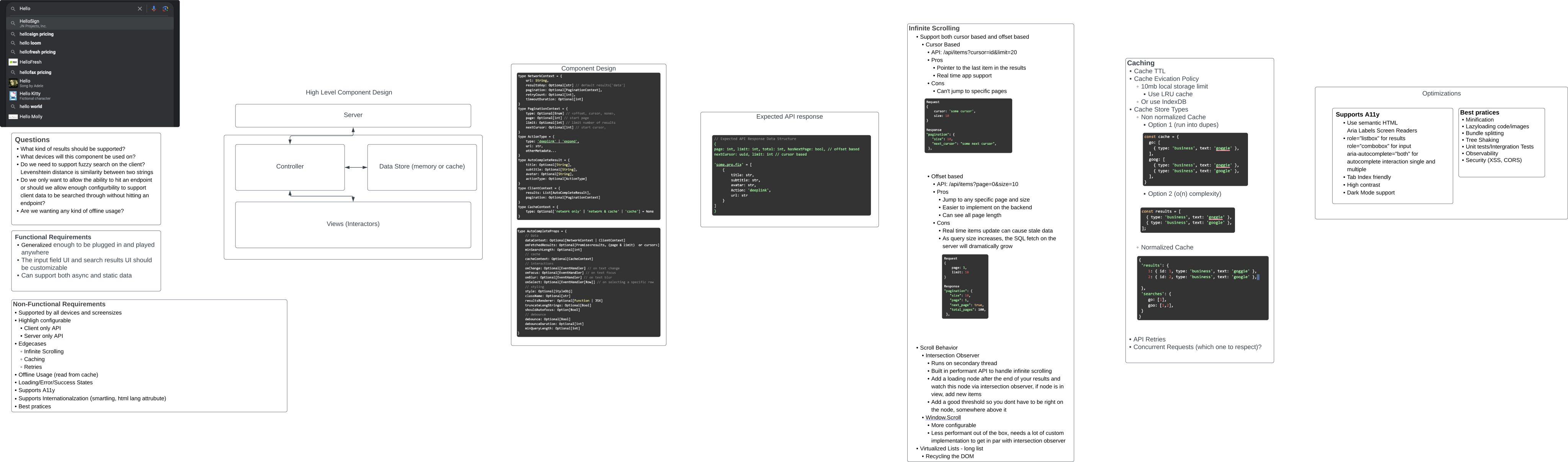
Clarifying Questions
Before designing and developing the autocomplete component, it’s crucial to address several clarifying questions. These questions help in understanding the specific requirements and expectations for the component, ensuring that the final product aligns with its users’ needs and the technical constraints of the environments in which it will be used.
Key Clarifying Questions
- Results Support: What types of results should the autocomplete support? Should it cater to only text-based inputs, or include images, links, or multi-format data?
- Device Compatibility: On which devices will this component be used? Does it need to be responsive and adaptable to various screen sizes and input methods (e.g., touch, mouse, keyboard)?
- Fuzzy Search Capability: Is fuzzy search functionality required on the client side? For instance, should the component utilize algorithms like the Levenshtein distance to identify similarities between input strings and suggest results, even with minor typos or variations?
- Data Source Flexibility: Should the component strictly rely on an API endpoint for data, or should we also support searching through client-side (local) data without making network requests?
- Offline Usage: Should offline functionality be supported? If so, how should the component handle data fetching and caching for offline usage?
- Performance and Scalability: What are the performance expectations regarding response time and scalability, especially when dealing with large datasets or high user traffic?
- Customizability and Integration: How customizable should the component be regarding styling and integration with various frontend frameworks or libraries?
Addressing these questions is crucial for developing a clear roadmap for a functional autocomplete component that aligns with the specific needs and constraints of its intended use cases.
Functional Requirements
- Plug-and-Play Capability: The component should be sufficiently generalized to integrate seamlessly into various environments or applications with minimal configuration.
- Customizable UI: Both the input field and search results UI must be customizable, allowing users to tailor the look and feel to match their application’s design.
- Data Source Versatility: The component must support both asynchronous data fetching (for API endpoints) and static data (client-side data), providing flexibility in how data is sourced and managed.
Non-Functional Requirements
- Device and Screen Size Compatibility: The component should be responsive and supported across all devices and screen sizes.
- Configurable Highlighting: Search result highlighting should be configurable, enhancing the user experience by making it easier to identify relevant suggestions.
- API Flexibility: Support for both client-only and server-only API configurations, allowing for varied backend and frontend architectures.
- Infinite Scrolling: Implementation of endless scrolling for search results, providing a seamless experience when dealing with large datasets.
- Edge Case Handling: Robust handling of edge cases to ensure reliability and consistency in various scenarios.
- Offline Usage: It is possible to read from a cache for offline usage, enabling functionality even without an active internet connection.
- Comprehensive State Management: Proper handling of loading, error, and success states, ensuring clear communication of the component’s status to the user.
- Accessibility (A11y) Support: Adherence to accessibility standards ensures the component is usable by as wide an audience as possible, including those with disabilities.
- Internationalization: Support for internationalization, including integration with tools like Smartling and utilization of the HTML
langattribute, to cater to a global user base. - Best Practices: Adherence to industry best practices in coding, design, and user experience to ensure a high-quality, reliable, and user-friendly component.
High-Level Component Design
The graphic depicts a structured approach to the autocomplete component design. Let’s break down the responsibilities of each element within this architecture.

View/UI Layer
- Input UI: This is where the user interacts with the component, typically a text input field. It captures the user’s keystrokes and triggers search queries.
- Results UI: This displays the search results dynamically according to the user type. It should update in real-time and allow the user to select from the suggested options.
Controller Layer
- Controller: This acts as the intermediary between the View/UI and the data sources (Cache or Server). It processes user input, sends search queries, and retrieves results.
Data Management Layer
- Cache: A temporary storage mechanism that holds previously fetched results to improve performance by reducing the number of server requests needed for repeated queries.
- Server: The external data source, typically a backend API, where queries are sent to fetch results that are not available in the Cache.
The Controller plays a pivotal role in this architecture. It must intelligently decide when to use cached results versus when to make a new query to the Server. It should also manage the state of the UI, displaying loading indicators or error messages as appropriate.
The Results UI is directly connected to the Controller, ensuring that the display of suggestions is updated promptly as new data is available. Similarly, the Input UI must communicate user input to the Controller without delay, providing a smooth and responsive experience.
This high-level design ensures that the autocomplete component is modular, with clear separation of concerns, facilitating maintenance and scalability.
Data Model Design
This segment will discuss the data types and their roles in the autocomplete component. This will clearly explain how data is structured, managed, and utilized within the system.
type NetworkContext = {
    url: String,
    resultsKey: Optional[str] // default results['data']
    pagination: Optional[PaginationContext],
    retryCount: Optional[int],
    timeoutDuration: Optional[int]
}
type PaginationContext = {
    type: Optional[Enum] // <offset, cursor, none>,
    page: Optional[int] // start page
    limit: Optional[int] // limit number of results
    nextCursor: Optional[str] // opaque cursor from the last page, not an integer page number,
}
type ActionType = {
    type: 'deeplink' | 'expand',
    url: str,
    otherMetadata...
}
type AutoCompleteResult = {
    title: Optional[String],
    subtitle: Optional[String],
    avatar: Optional[String],
    actionType: Optional[ActionType]
}
type ClientContext = {
    results: List[AutoCompleteResult],
    pagination: Optional[PaginationContext]
}
type CacheContext = {
    type: Optional['network only' | 'network & cache' | 'cache'] = None
}
type AutoCompleteProps = {
    // Data
    dataContext: Optional[NetworkContext | ClientContext]
    onFetchedResults: Optional[Promise<results, (page & limit) or cursor>]
    minSearchLength: Optional[int]
    // cache
    cacheContext: Optional[CacheContext]
    // interactions
    onChange: Optional[EventHandler] // on text change
    onFocus: Optional[EventHandler] // on text focus
    onBlur: Optional[EventHandler] // on text blur
    onSelect: Optional[EventHandler[Row]] // on selecting a specific row
    // styling
    style: Optional[StyleObj]
    className: Optional[str]
    resultsRenderer: Optional[Function | JSX]
    truncateLongStrings: Optional[Bool]
    shouldAutofocus: Option[Bool]
    // debounce
    debounce: Optional[Bool]
    debounceDuration: Optional[int]
    minQueryLength: Optional[int]
}
NetworkContext
- url: The endpoint URL for the API where the search queries will be sent.
- resultsKey: A key to extract the results from the API response. Defaults to
results['data']if not specified. - pagination: An optional object of
PaginationContexttype for handling pagination of results. - retryCount: An optional integer defining how many times a failed request should be retried.
- timeoutDuration: An optional integer specifying the timeout duration for the network request in milliseconds.
PaginationContext
- type: An optional enumeration defining the pagination strategy (offset, cursor, none).
- page: An optional integer indicating the starting page number for pagination.
- limit: An optional integer defining the maximum number of results to be returned.
- nextCursor: An optional integer used as a cursor for the next set of results, typically in cursor-based pagination.
ActionType
- type: Specifies the action type, like ‘deeplink’ for redirecting or ‘expand’ for additional UI interaction.
- url: A string URL to be used in conjunction with the action type.
- otherMetadata: Additional metadata that might be required for the action.
AutoCompleteResult
- title: An optional string for the main text of a result.
- subtitle: An optional string for secondary text.
- avatar: An optional string URL for an image associated with the result.
- actionType: An optional
ActionTypedefining what action occurs when a result is selected.
ClientContext
- results: A list of
AutoCompleteResultobjects, which are used to render each result row in the UI. - pagination: An optional
PaginationContextfor managing client-side pagination.
CacheContext
- type: An optional enumeration to define the caching strategy, such as ‘network only’, ‘network & cache’, or ‘cache’.
AutoCompleteProps
- dataContext: An optional union type of either
NetworkContextorClientContext, allowing the consumer to specify if they are using an API or static data. - onFetchedResults: An optional promise that fetches results data from the API, with the consumer having the option to process this data.
- minSearchLength: An optional integer that determines the minimum search length before fetching results.
- cacheContext: An optional
CacheContextdetailing the caching strategy. - onChange, onFocus, onBlur, onSelect: Optional event handlers for various user interactions with the input field.
- style: An optional
StyleObjfor CSS-in-JS styling. - className: An optional string for CSS class name.
- resultsRenderer: An optional function or JSX to allow the consumer to render custom UI in the results.
- truncateLongStrings: An optional boolean to truncate long strings in the search results.
- shouldAutofocus: An optional boolean to determine if the input field should be auto-focused on page render.
- debounce: An optional boolean to decide if keystrokes should be debounced.
- debounceDuration: An optional integer specifying the debounce duration for keystrokes.
These data models provide the foundation for a robust, flexible, and customizable autocomplete component. They ensure that the element can be tailored to a wide range of use cases and efficiently handle various data types and interactions.
Expected API Request and Response
API Request
When the autocomplete component requests data from the server, it typically sends query parameters to fetch relevant suggestions based on the user’s input. For an offset-based pagination, it may include parameters like page and limit, whereas for cursor-based pagination, it might send the nextCursor and limit. These are sent as part of the HTTP request, usually as a GET request, to the API endpoint specified in the NetworkContext.
API Response

The server response expected by the autocomplete component is a JSON object structured to include pagination details and a list of result items. The structure is as follows:
- page: (int) The current page number of results, used for offset-based pagination.
- limit: (int) The number of results per page or request.
- total: (int) The total number of results available for offset-based pagination.
- hasNextPage: (bool) A flag indicating whether there are more pages to fetch, used for offset-based pagination.
- nextCursor: (uuid) A unique identifier used to fetch the next set of results in cursor-based pagination.
Nested within the response is a list of results prefixed by a key (e.g., ‘some.pre.fix’). Each item in the list is an object representing an individual result, with the following attributes:
- title: (str) The main text of a suggestion.
- subtitle: (str) A secondary text providing additional information.
- avatar: (str) A URL to an image associated with the suggestion.
- Action: (str) The type of action to perform on selecting the suggestion, such as ‘deeplink’.
- url: (str) The URL to which the ‘deeplink’ action will navigate.
The component’s Controller will parse this response, extracting the relevant data based on the resultsKey specifications in the NetworkContext. It will then update the Results UI accordingly.
For example, if the resultsKey is set to 'some.pre.fix', the controller will look for this key in the JSON response and render the associated results list.
Handling Edge Cases, Caching, and Offline Usage
Edge Cases
1. Handling Concurrent Requests/Race Conditions
The autocomplete component should implement a strategy to manage concurrent requests to ensure that it displays results for the most recent user input and not necessarily the latest response received. Due to network latency, the latter may not correspond to the latest query.
Given the presence of a cache system, maintaining a map of results keyed by the search query string is the preferred method. This approach allows the component to present results matching the current input value, even if the responses arrive out of order. It efficiently leverages the cache by referencing past search queries, avoiding unnecessary network requests.
2. Offline Usage
For offline scenarios, the component can enhance user experience by:
- Relying solely on cached results when no network connection is available. While this limits the results to previously searched terms, it provides some functionality without a live connection.
- Preventing network requests to save CPU cycles and battery life.
- Indicating within the UI that the component is offline to set appropriate user expectations.
Cache Strategies
1. Hash Map Cache
A hash map with the search query as the key and results as the value is a straightforward approach. However, if not appropriately managed, it can lead to duplicate entries.
Example:
const cache = {
  go: [
    { type: 'business', text: 'goggie' },
  ],
  goog: [
    { type: 'business', text: 'goggie' },

    { type: 'business', text: 'google' },
  ],
}
2. List of Results
Storing results as a list can lead to inefficiencies in search time (O(n)) due to the need to filter through all results to find matches.
Example:
const results = [
  { type: 'business', text: 'goggie' },
  { type: 'business', text: 'google' },
];
3. Normalized Store
A normalized store, where each result is stored once and referenced by IDs in search query arrays, is the most efficient and scalable option, especially for applications with longer sessions and more extensive data.
Example:
{
 'results': {
    1: { id: 1, type: 'business', text: 'goggie' },
    2: { id: 2, type: 'business', text: 'google' },
 },
 'searches': {
    go: [1],
    goo: [1,2],
 }
}
Which Cache Structure to Use?
- The first option may suffice for short-lived websites or sessions due to its simplicity.
- Due to its efficient storage and retrieval, the normalized store is the best approach for long-lived websites or applications with extensive and repetitive use, like Facebook.
Implementing Infinite Scrolling
Infinite scrolling is a crucial feature for modern web applications, particularly for components like autocomplete, which can potentially display many results. It provides a better user experience by loading data as needed, without overwhelming the user with excessive information at once.
Infinite Scrolling Strategies
1. Cursor-Based Pagination
Cursor-based pagination is advantageous for real-time applications where the dataset is continuously changing. It fetches the next set using a pointer to the last item in the results.
Pros:
- It allows for a seamless continuation of the data stream, which is ideal for real-time updates.
Cons:
- The inability to jump to a specific page can limit users’ ability to navigate to a known position in the list.
Example Request and Response:
Request:
{
    "cursor": "some cursor",
    "size": 10
}


Response:
"pagination": {
   "size": 10,
   "next_cursor": "some next cursor"
}
2. Offset-Based Pagination
Offset-based pagination is a suitable option for applications where jumping to specific pages is necessary. It’s straightforward and uses page numbers and size to fetch data.
Pros:
- Easy implementation and direct navigation to any page.
Cons:
- Potential performance issues with large datasets: later pages get slower as the offset grows (the server has to skip more rows).
Example Request and Response:
Request:
{
    "page": 1,
    "limit": 10
}


Response:
"pagination": {
   "size": 10,
   "page": 1,
   "next_page": true,
   "total_pages": 100
}
Scroll Behavior Implementation
Intersection Observer
This modern API allows performant asynchronous tracking of the intersection between an element and its ancestor elements or the viewport.
Advantages:
- The browser does the intersection checks off the main thread, then delivers callbacks on the main thread.
- It’s inherently performant and built for purposes like infinite scrolling.
Usage:
- A loading node is observed, and new items are fetched and rendered when it comes into view.
- A threshold can trigger loading before the node is in view, providing a smoother experience.
Window.Scroll
This more traditional approach offers greater configurability but requires additional custom code to achieve performance comparable to the Intersection Observer.
Also, consider using virtualization, which means recycling dom nodes.
Debouncing to Reduce Server Load on Change
When designing interactive components, such as an autocomplete widget, it’s essential to consider the frequency at which user actions trigger data requests. Every keystroke in an autocomplete field could send a request to the server for matching results. If not managed properly, this can result in a significant performance bottleneck due to the high volume of requests, leading to an overburdened server and a laggy user experience.
To mitigate this, a common strategy employed is debouncing. Debouncing is a programming technique that prevents time-consuming tasks from being executed too frequently, which can harm performance or user experience. In the context of an autocomplete component, debouncing means waiting for a certain amount of time after the last keystroke before sending a request to the server. Suppose the user types another character; the timer resets. This way, we only send a request after the user has stopped typing for a predetermined time, rather than on every keystroke.
Benefits of Debouncing:
- Reduced Server Load: By limiting the number of requests sent to the server, debouncing reduces the load, helping prevent server overload, especially during peak usage times.
- Improved User Experience: Debouncing minimizes the lag between user actions and the application’s responses, ensuring the application remains responsive and fluid.
- Lowered Network Traffic: Fewer requests mean less data being sent over the network, which can reduce costs and improve performance for users on slower internet connections.
- Avoidance of Race Conditions: Debouncing can also help mitigate the risks of race conditions, where the server might return responses out of sequence, by reducing the number of requests.
Implementation Considerations:
- Timing: The debounce duration should be chosen carefully to ensure optimal performance. If it is too short, you may not be able to significantly reduce the load; if it is too long, the user experience may suffer due to perceptible delays in response.
- User Behavior: Considering user behavior is crucial when setting the debounce time. For example, if users typically type quickly, a slightly longer debounce time might be appropriate to ensure that the system responds when they have likely finished typing a thought.
- Feedback: During the debounce delay, it’s essential to provide visual feedback, such as a loading spinner, to indicate that the application is processing the user’s input.
By incorporating a debounce strategy, the autocomplete component becomes more scalable and efficient, effectively reducing unnecessary server load while maintaining a smooth user experience.
Accessibility and Best Practices
Accessibility (A11y)
Ensuring that the autocomplete component is accessible is paramount. Accessibility features enable users with disabilities to navigate and interact with web content effectively. Here are some key accessibility practices to implement:
- Semantic HTML: Use semantic HTML tags to convey meaning and structure. For instance,
<input>for input fields,<ul>for lists of results, and<li>for individual items. - ARIA Labels and Roles: Implement ARIA (Accessible Rich Internet Applications) attributes to enhance the accessibility of UI components that cannot be adequately described with HTML alone. For example:
role="listbox"For the container that holds the list of results to inform assistive technologies that it contains selectable options. role="combobox"for the input field to indicate that it is a composite widget that allows both input and selection.aria-autocomplete="both"to suggest that the combobox provides suggestions that complete the typed text and enable the user to select from pre-defined options.- Tab Index: Ensure the tab order is logical and intuitive, allowing users to navigate the component using the keyboard.
- High Contrast: Design with high contrast ratios to make text and UI elements stand out, especially for users with visual impairments.
- Dark Mode Support: Offer a dark mode version of the component to reduce eye strain and accommodate user preferences for a darker color scheme.
Best Practices
Beyond accessibility, adhering to best practices in web development can vastly improve the autocomplete component’s performance, maintainability, and security.
- Minification: Minify CSS and JavaScript files to reduce size and improve load times and performance.
- Lazy Loading: Implement lazy loading for code and images, which defers the loading of non-critical resources until page load time and loads them only when needed.
- Bundle Splitting: Use bundle splitting to break down a large JavaScript bundle into smaller chunks that can be loaded on demand, reducing the initial load time.
- Tree Shaking: Employ tree shaking to eliminate unused code from your final bundle, ensuring that only the necessary code is included.
- Testing: Write unit and integration tests to catch bugs early and ensure that individual components and their interactions work as intended.
- Observability: Implement monitoring and logging to observe the component’s performance in real-time, which aids in debugging and optimizing the component.
- Security: Sanitize user input to secure the component against common web vulnerabilities, such as Cross-Site Scripting (XSS). Ensure proper handling of Cross-Origin Resource Sharing (CORS) policies to prevent unauthorized access to resources.
Incorporating these accessibility and best practice guidelines will result in a robust, user-friendly, and secure autocomplete component that can be reliably integrated into any web application.
In conclusion, design and implement a general-purpose, scalable, and reusable front-end autocomplete component. Each article segment builds upon the previous one, forming a cohesive blueprint for a practical user interface element.